What happens when multi-mood experiences feel connected - A finance app that speaks Genz
Product design project which focuses on Visuals that changes its visual theme to match the user's emotional state or the function of the task.
Timeline- 6 days
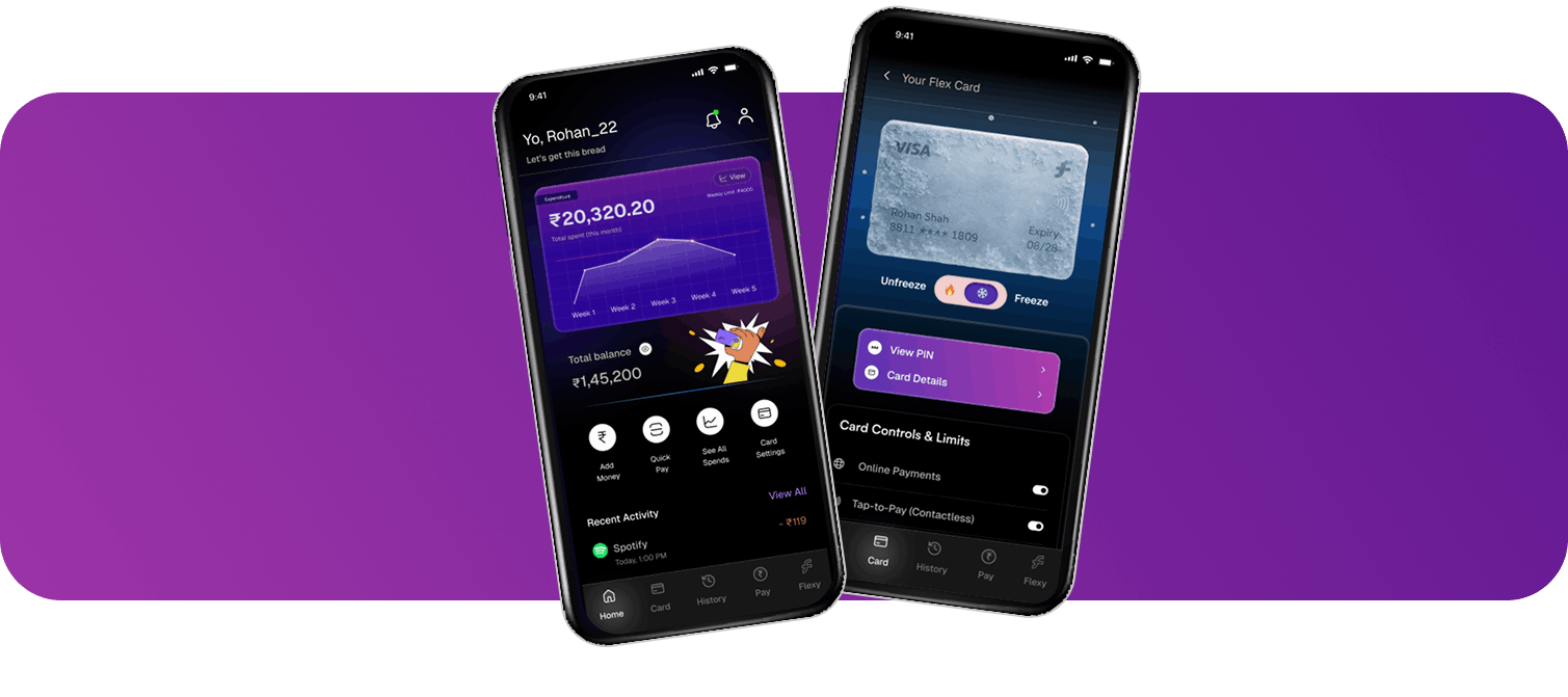
Fintech startup building a revolutionary financial tracking app specifically for the GenZ audience. Our core product is an AI-powered assistant, "Flexy," that handles all the boring math (budgeting, tracking, insights) in the background.
Our users are bored of the sterile, "corporate" look of traditional banking apps.
Watch video here
LinkedIn postLet's look at Rohan's Journey
Rohan recently got a job 6 months ago and manages expenses like rent, subscriptions, shopping etc.
he also wants to purchase a new bike so, he needs to save some money. He's proud of his independence, but he also has a dream to buy a new bike. To make that happen, he knows he'll need to start saving seriously.
Rohan opens his finance app flexy to check
- How much he has spent this week
- And How much limit he has left
Whether he is on track with his savings. he is little tense.
He notices it, but dismisses it for now - maybe later, he thinks.
"Am I spending too much?"
"Will I still be able to save enough for my bike this month?"
Concerned, he takes an immediate action -
He decides to freeze card temporarily to avoid impulse buys from making any unplanned or emotional purchases as he wants to save money for his dream bike
while he reviews his recent transactions again. One of them reminds him -
He still needs to send money to a friend from last night's outing.
He unfreezes briefly, decides to transfer the amount, and then will freezes again. he is little worried.
He went ahead and paid Sid, just like he did last weekend.. completes the transaction effortlessly and securely with just a swipe. hes little stress is relieved
Now his worry shifts to planning:
"Okay… rent + subscriptions… plus that party expense… Can I still save?" he is relief and happy
He asks it for a new monthly budget, especially because last month he bought a sneaker impulsively, which threw him off track.
Flexy gives him a clear, realistic monthly budget plan - one that ensures he can still meet essentials, have a small amount for leisure, and save a dedicated portion for his bike.
Rohan feels relieved. He started the app just to check expenses, but walked away with clarity and control. This month, he feels more confident - his bike is getting closer. Wohhoooo 🏍️
Why I designed the hero card on homescreen
as graph?
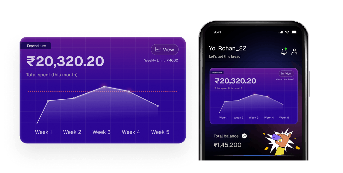
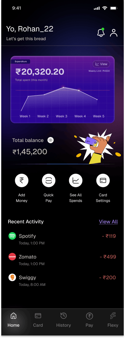
Context - This is the centerpiece of the screen. It's not just data; it's an emotional and gamified status of their spending - so, this was the element which was going to set the tone of my theme.
Final Card Design
When I delved deep into competitors
I explored different apps like CRED, Pop UPI, Jar, Spotify Wrap etc. After observing the same colors in these apps I researched about what is the reason of dark themes and why GenZ users tend to use it?
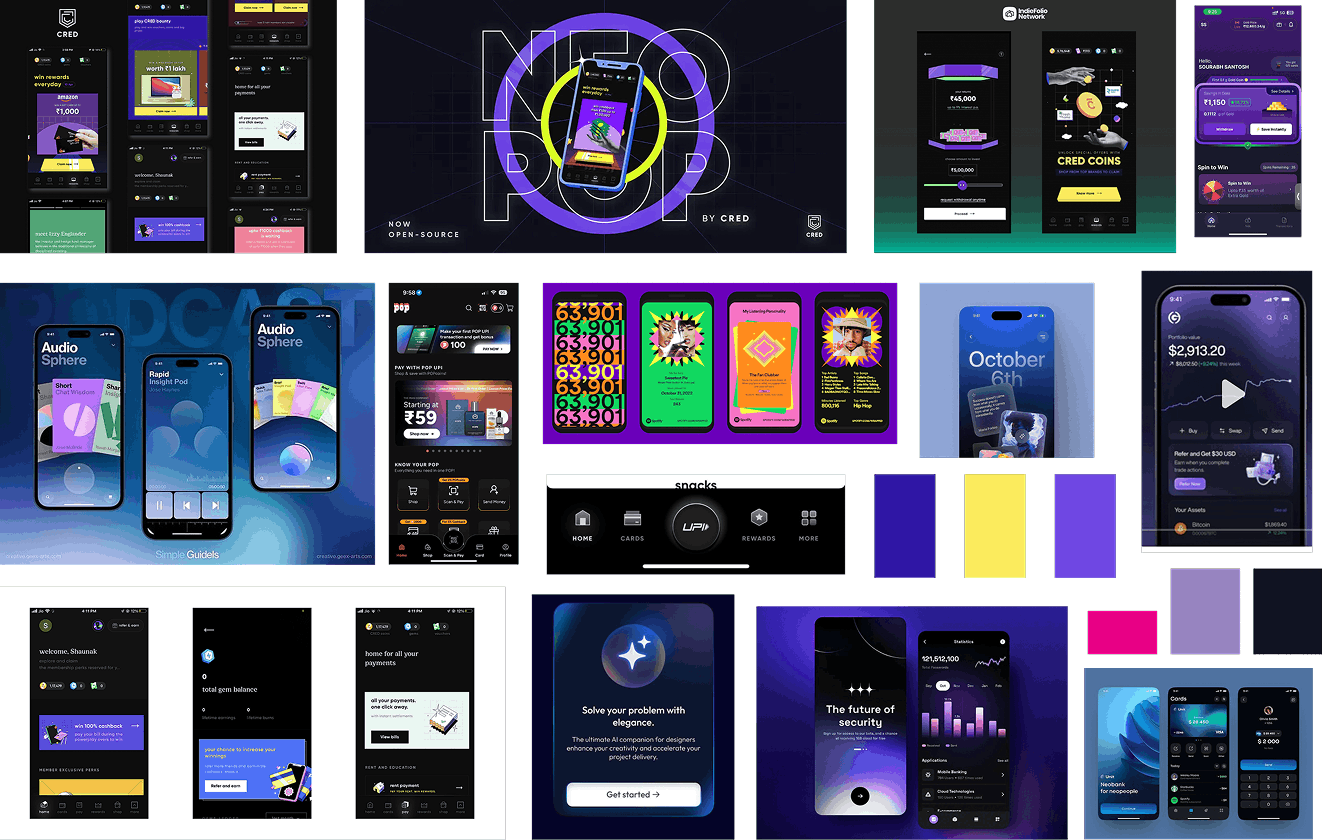
What I decided after doing competitor research and reading about emotions was -
1. GenZ users are more into dark themes
2. Colors - vibrant colors because it resonates more with GenZ
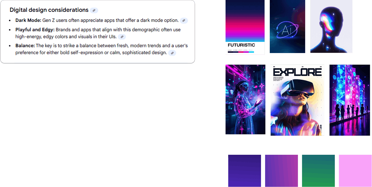
For going deep into the colors I gathered a moodboard based on futuristic colors and themes.
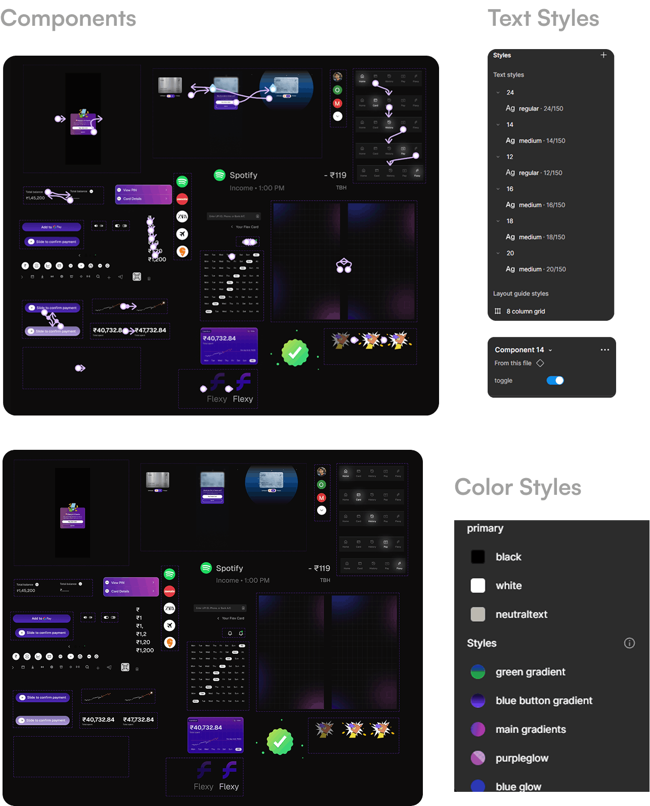
Color styles
I decided to use a little dark gradient background and whites and blacks for their CTA buttons and use white on top.
User flow of card design
Blob-Based Card (Low Information Clarity)
 Iteration 1
Originally I had a idea about adding a blob or some motion related visual but, it was not giving enough information and after ideating on blob I started exploring graph card to give enough information to users.
but, why graph?. Primary goal of users is see instantly "how much spend"? "is any update"? Showing the balance first reduces anxiety.
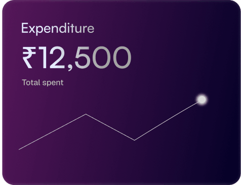
Graph Added for Basic Spend Clarity
 Iteration 2
Next, I added graph that can tell visually how much user spend.
So, I decided to iterate further and give the necessary information to the user. But, still the main aim was to keep the card as small as possible due to the space constraint on the first fold of the page.
Adding information for more clarity
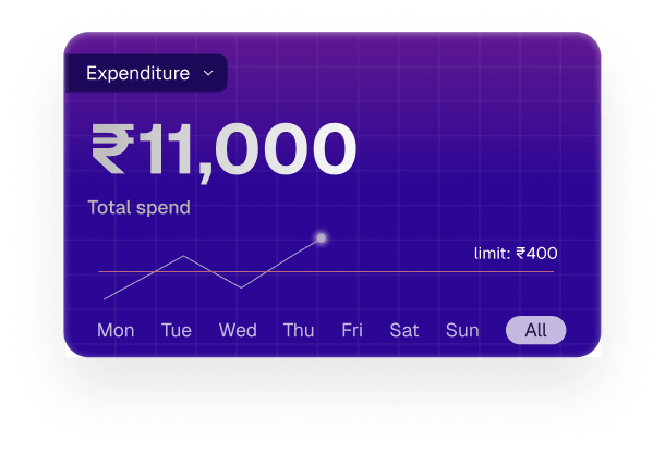 Iteration 3
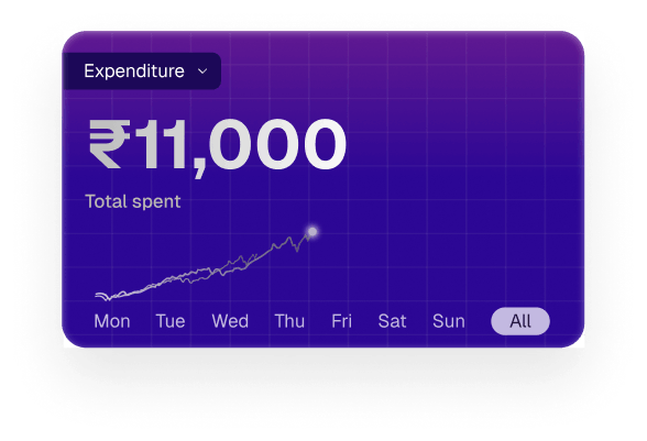
Next, I added the card layout where I decided to represent the days on the x-axis.
When I discussed it with my peers, they were still confused about what was actually happening in the layout.
Adding Details to the card
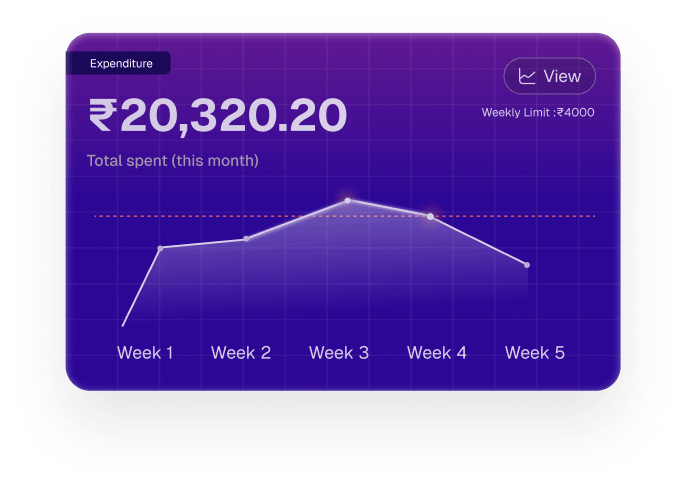 Iteration 4
→ Expenditure label to quick give overview
→ Total spend shown prominantly
→ Limit which user had set
→ Per day limit set by the user
I chose to go with this design, but it lacks a signifier, so the user wouldn't realize they can tap on it.
So, Its time for final card
Added a signifier to view the full data about the spend
Weekly limit set by the users weekly and the total spend is shown as per the month.
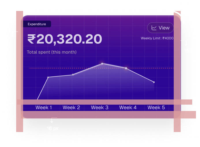
Added a signifier to view the full data about the spend
Weekly limit set by the users weekly and the total spend is shown as per the month.
Below is how I constructed- Color styles, Spacing
Spacing of 8px Grid
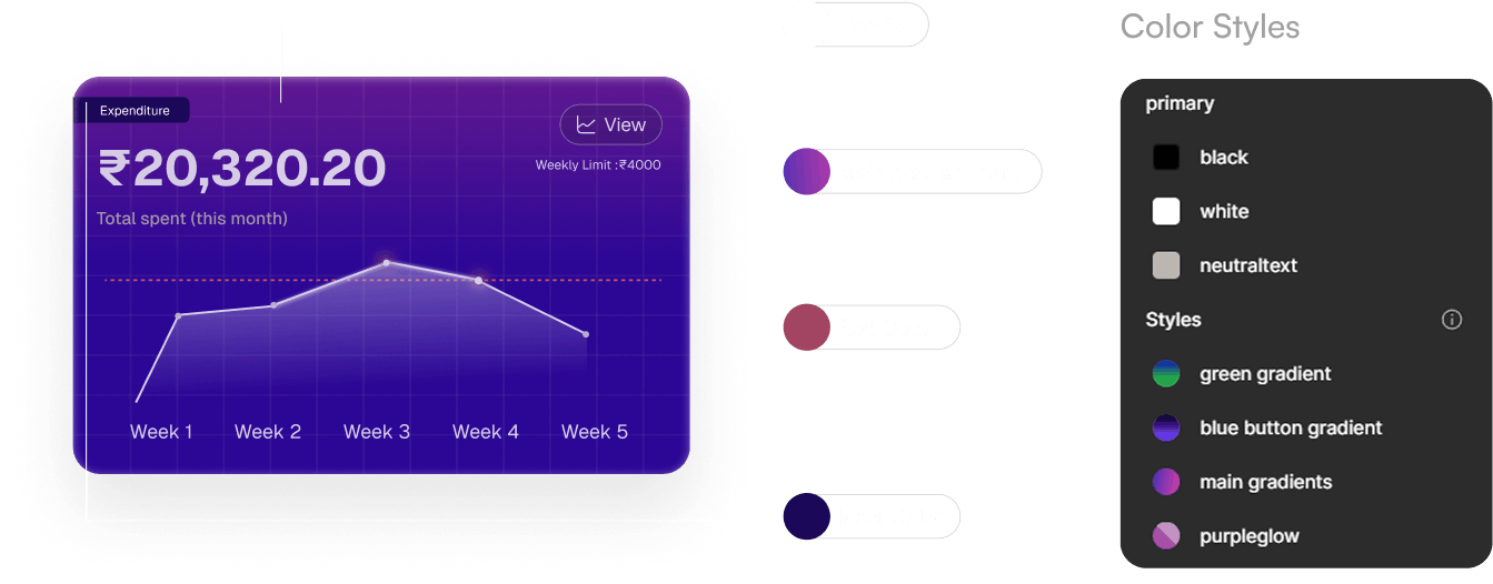
Card with final homescreen
Why I worked on enhancing the chat
screen theme
Watch Final Chat Screens
Let me take you through the decision I took to build a theme around it.
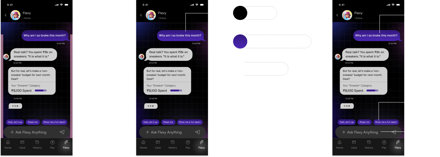
While designing the Flexy chat interface, I realized that financial conversations can often feel dull or intimidating. Users already associate budgeting with restriction - so my goal was to make the chat experience feel personal, engaging, and emotionally lighter.
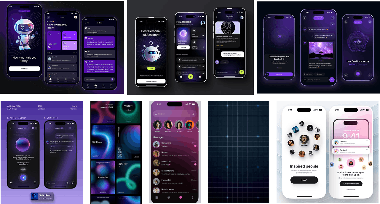
A pixel-art window with rain running down it. A distant, slowly rotating vinyl record. A simple, old CRT monitor scanline effect - these were some examples given in the brief, so I first explored that.
User flow of chat theme
Inspirations of chat theme
Evolution of Chat theme
Iteration 1
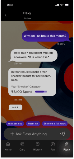
Old CRT chat theme
The initial versions seemed neutral to the point of feeling uninspired.
They were usable but not expressive, definitely not modern or Gen Z in appeal.
This made me dive deeper into exploring different thematic directions.
Iteration 2
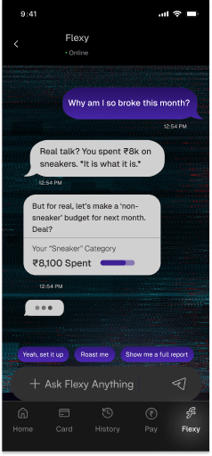
Vinyl record
When I noticed the theme was too bright and didn't align with the overall app aesthetic, I decided to scrap the idea and choose from the existing homescreen instead.
I realised consistency was more important than forcing a new visual direction. This also helped maintain a familiar experience for users and avoided creating unnecessary visual noise.
Iteration 3
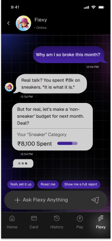
Graph theme
This theme was already present in the card where I used the graph in the background, so I felt it made sense to continue with the same look. It aligned well with the app's overall visual direction, and the Gen Z aesthetic also felt strong and consistent.
It also ensured users wouldn't have to re-learn the interface every time the context changed. Overall, sticking to this theme made the design feel more cohesive, modern, and intentional.
Final chat theme Explained
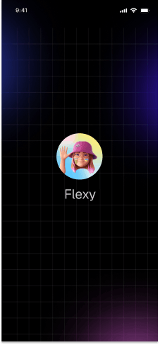
The AI avatar I chose was a Gen Z-styled character with a cool cap. It instantly added a fun, youthful vibe to the interface. The character also helped make the experience feel more approachable and less formal.
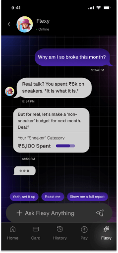
Because the graph was already used in the homescreen card with a dark, dynamic look, it naturally complemented the overall theme. This consistency made it the strongest option, so I decided to conclude my exploration here.
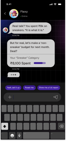
At this stage, Flexy AI steps in with a smart, context-aware suggestion about your spending card. Instead of navigating through multiple screens, users can manage everything right inside the chat.
Whether it's understanding where money is going, setting boundaries, or asking follow-up questions, the entire interaction happens naturally through conversation - making the experience feel simple, personal, and completely intuitive.
Let's look at the construction of the screen
Why I imagined the card's freeze and unfreeze states this way?
Watch video here
Iteration 1– First Exploration of black theme
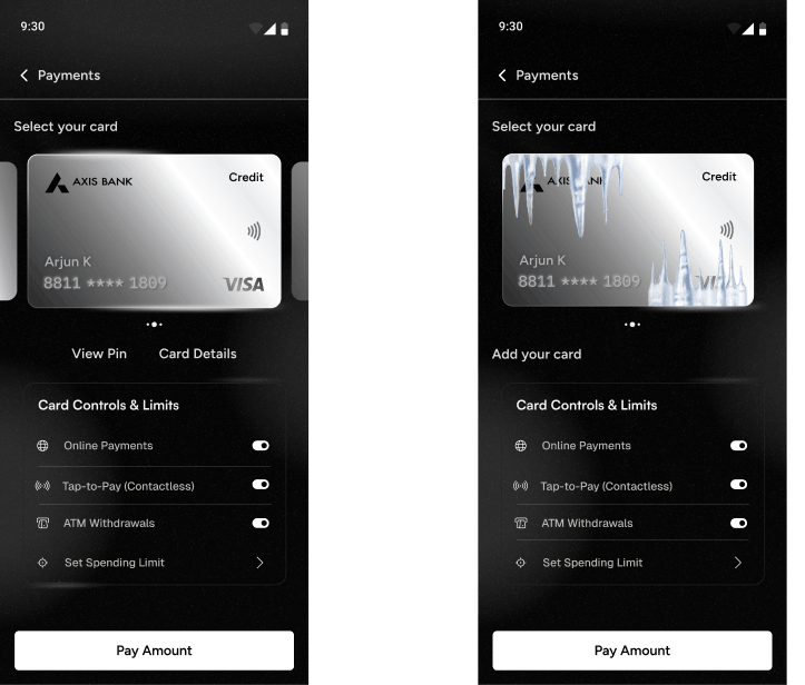
Black theme to go the homescreen theme.
To show the freeze state, I initially added an ice effect on the card.
But this didn't align with Jakob's Law, as it felt unfamiliar compared to common app patterns. So, I decided to change the approach.
Final Screen Explained
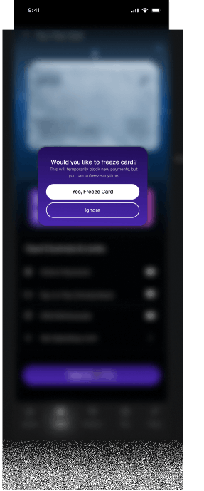
After tapping the toggle, the card flips and a popup appears in the next step.
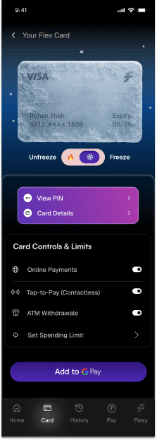
Primary icons are placed in the circle to primarily highlight.
The secondary card icons are less highlighted, and the settings appear less prominent.
Gestalt law of proximity goes as, the groups are separated properly.
Law of similarity as the elements in the card are similar so, there's a sense of having them as similar elements.
When the user taps the toggle, a popup appears asking them to confirm whether they want to freeze the card.
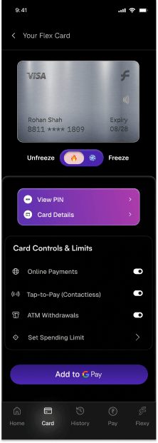
Final freezing state after clicking on toggle.